Website Design ⎯⎯ 2020
Design & Research
Overview
Oggvo is an online reputation management service agency based in Seattle, Washington. It helps rectify the situation of unhappy customers and gently reminds customers to leave reviews. It enables businesses to showcase the best reviews on their website or social media channels.
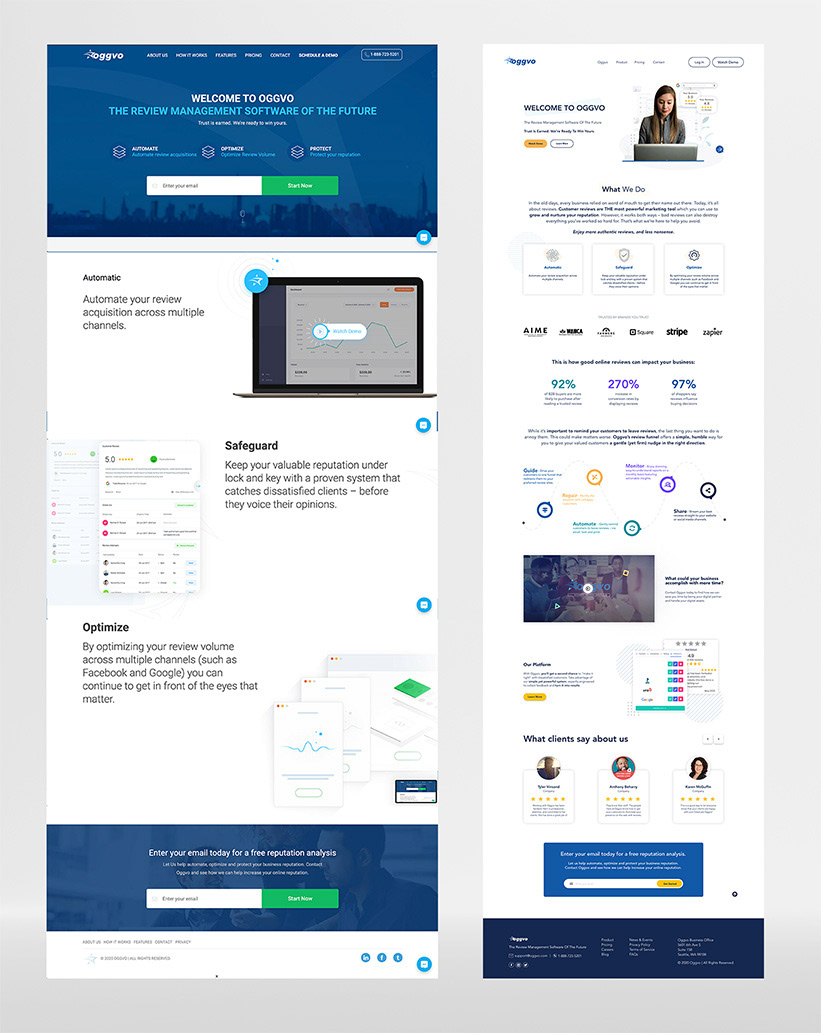
Homepage (Before)
Homepage (After)
My Role
I collaborated with Oggvo to produce a fresh design for their company website, focusing on a clean, contemporary, and practical aesthetic.
Research & Analysis
The previous website design failed to meet the primary objectives of a reputation management company, namely, promoting services and attracting new prospects. Its pages were overly complex with many blocks, laden with excessive text, and featured outdated, unappealing design elements. Consequently, the website experienced heightened bounce rates and low conversion rates.
Challenge
One of my initial hurdles in developing the UI/UX design for the new website was ensuring its longevity in terms of appearance and user experience. The previous design appeared outdated, leaving little room for salvage. Therefore, the focus shifted towards creating a design that could stand the test of time, easily undergo refinement to stay current, and deliver a captivating first impression while keeping visitors engaged.
Goals and Objectives
Improving usability, increasing conversion rates, enhancing visual appeal, and providing an easy-to-use website, where its structure and purpose should be clear to all users. A clear understanding of the product with an easy-to-follow user flow that is straightforward and doesn't confuse first-time visitors.
Contributions
• I proposed a new Information Architecture for the website, including the navigation menu, page hierarchy, and reorganized content areas.
• I redesigned the customer journey map and created new wireframes and user flows for the website.
• Created icons and a design library for their website and future use.
Deliverables
• Analysis & evaluation of the current website, user feedback, market trends, and competitor analysis
• User Flows, Site Maps, and improved Navigation
• Low-fidelity and High-fidelity wireframes
• Visual design concepts and translate wireframes into user interface (UI) designs for all the screens.
• Content Strategy for updating and organizing website content to improve clarity and engagement
• Motion study for Infographics
• Development Assets for developers to implement the new design
• Testing and Feedback loops to identify areas for improvement before finalizing the design
Wireframes
I utilized Adobe XD for drafting wireframes and crafting a clickable prototype. These wireframes were employed during Usability Testing sessions to gather feedback from users.
Low-fidelity Key Screens
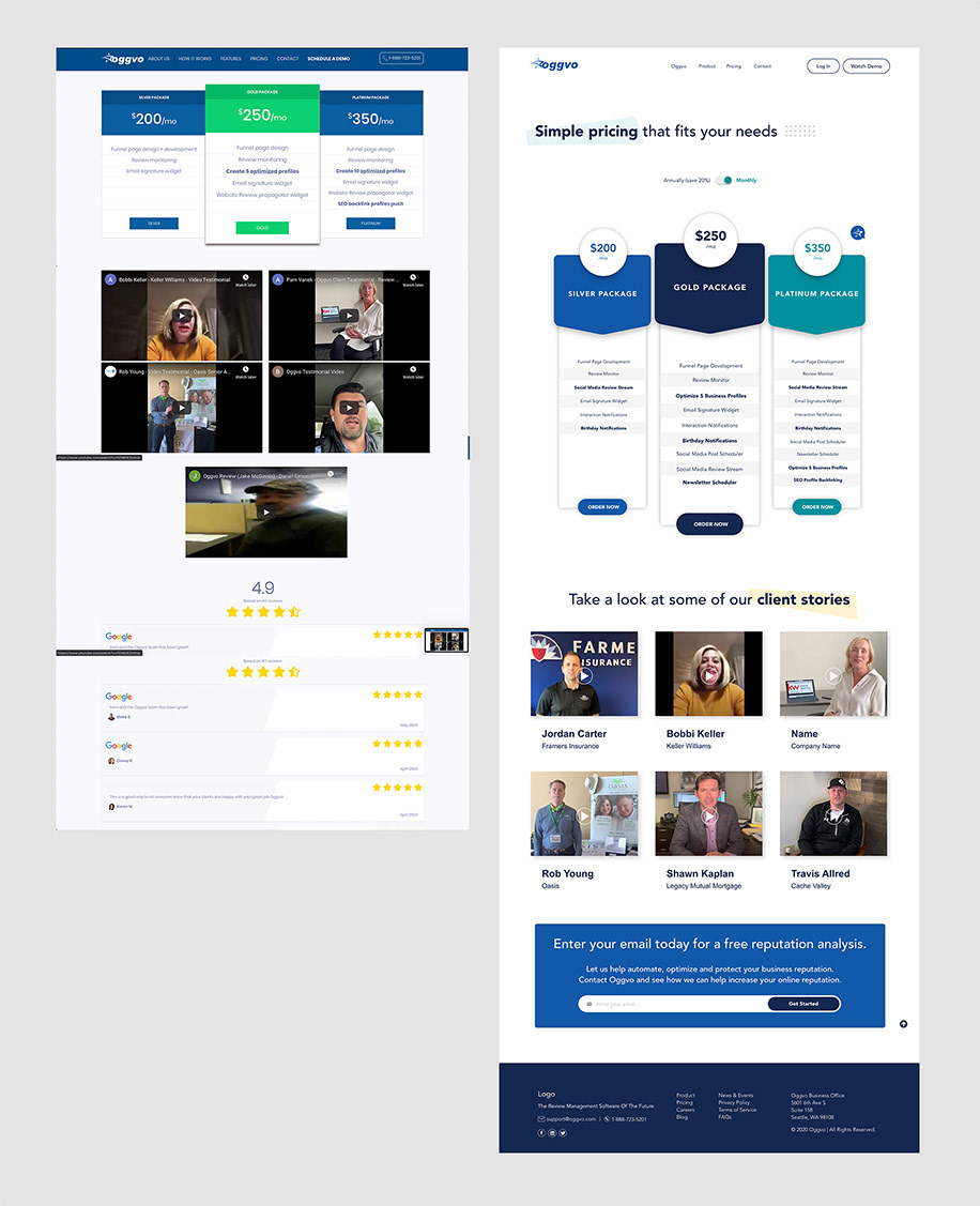
Hi-fidelity Key Screens


Results & Outcomes
This new structure addressed the initial goals and objectives of the project, the needs of the target audience, improved usability, increased conversion rates, improved user satisfaction, and received positive feedback from users and stakeholders.
Lessons Learned
• The challenges encountered during the redesign process were gathering information and recreating everything from scratch, with not much available at the start of the project.
• Understanding the product & market, studying competitors, and iterating through regular meetings with the founder helped me overcome these challenges. This approach will enable me to work more effectively in my future projects.
Impact
• Improved User Experience, made it easier for visitors to navigate, find information, and complete tasks. This increased user satisfaction, brand recognition, and loyalty.
• By optimizing the design and layout of key pages, such as product pages or checkout flows, clear calls to action, streamlined forms, and persuasive visual elements, the redesign helped improve conversion rates.
• Ultimately, the impact of a website redesign is aligned with the broader goals of the business, generating leads, driving sales, and increasing brand awareness. The redesign contributed to these overarching objectives.
Tools Used:
• Adobe Illustrator
• Adobe After Effects
• Adobe Photoshop
• Adobe XD