Graphic Design ⎯⎯ 2019
Event Branding
Overview
The John L. Scott Convention 2019 was a flagship annual event bringing together real estate professionals, brokers, and partners to celebrate success and inspire future growth. As the Graphic Designer for the event, my role was to create a compelling and cohesive visual identity that elevated the attendee experience across all touchpoints, from print materials to digital displays.
The 2019 John L. Scott Convention marked a pivotal moment, positioned on the edge of a new decade, the theme “2020 and Beyond” called for a brand identity that felt bold, forward-thinking, and deeply rooted in the technological transformation of real estate.
John L. Scott Convention And Tradeshow 2019
My Role
As the graphic designer, I wanted the visual language of the event to reflect both the clarity of vision and the accelerating role of technology, not just in tools, but in the way people connect, search, and dream about homeownership.
• Lead Graphic Designer responsible for event branding
• Collaborated with internal marketing teams and external vendors
• Delivered designs across print, digital, and environmental formats
Laptop Decal To Give Away At The Event To All The Attendees
Key Deliverables
• Event Branding: Logo lockups, color palette, and typography system
• Print Collateral: Name badges, lanyard cards, signage, brochures, bottle labels, business cards, lunch tickets, and decals
• Large Format Graphics: Yard arms, wayfinding banners, stage graphics
• Digital Assets: Promo flyers, social media graphics, web banners, and email marketing,
• Merchandise: T-shirt and swag item graphics
Branding Direction
The branding approach was minimal yet striking, intentionally diverging from traditional real estate visuals. Inspired by tech keynote aesthetics and modern design, I leaned into bold typography, modular layouts, and layered transparencies —design decisions that gave even static materials a sense of movement and progression.
Abstract line work and geometric shapes suggested pathways, networks, and forward motion, alluding to how data and digital tools are redefining the home-buying journey.
The result was an identity that honored John L. Scott’s trusted brand while propelling it visually into the future, one that helped attendees not just imagine 2020 and beyond, but feel like they were already part of it.


Design Goals
• Unify the visual language of the event across multiple media formats
• Reflect John L. Scott’s core brand identity while injecting a sense of excitement and modern professionalism
• Enhance attendee engagement through visually dynamic touchpoints
Swag Bag And Name Badge For The Event
⎯⎯ Typography
Color Story
Each color was selected to embody an aspect of the future-facing narrative:
Vibrant Yellow
Symbolizing energy, possibility, and innovation. Yellow became our spotlight color, a metaphorical sunrise over a new decade. It brought warmth and attention to key elements, from signage highlights to CTAs on digital displays.
Symbolizing energy, possibility, and innovation. Yellow became our spotlight color, a metaphorical sunrise over a new decade. It brought warmth and attention to key elements, from signage highlights to CTAs on digital displays.
Tech Turquoise
Representing digital evolution and connectivity, this modern hue gave the visuals a sense of motion and agility. Turquoise is linked to themes of mobile-first design, virtual tours, and data-driven decision-making that are reshaping real estate.
Representing digital evolution and connectivity, this modern hue gave the visuals a sense of motion and agility. Turquoise is linked to themes of mobile-first design, virtual tours, and data-driven decision-making that are reshaping real estate.
Sleek Black
Used to ground the palette and give the design sophistication and edge. Black added contrast and authority, anchoring the otherwise bright palette with strength and focus.
Used to ground the palette and give the design sophistication and edge. Black added contrast and authority, anchoring the otherwise bright palette with strength and focus.
Charcoal Gray
Offered balance and neutrality, creating space for content to shine. It also spoke to the reliability and professionalism that define John L. Scott’s legacy.
Offered balance and neutrality, creating space for content to shine. It also spoke to the reliability and professionalism that define John L. Scott’s legacy.
White Space
Strategic use of white wasn't just about cleanliness; it symbolized clarity, vision, and openness. It gave room for ideas to breathe and reinforced the future-looking optimism of the theme.
Strategic use of white wasn't just about cleanliness; it symbolized clarity, vision, and openness. It gave room for ideas to breathe and reinforced the future-looking optimism of the theme.
⎯⎯ Color Palette
Vibrant Yellow Tech Turquoise Charcoal Gray Sleek Black White Space




⎯⎯ The Logo
The logo was built around the idea of vision, progress, and technological momentum. Inspired by tech conference aesthetics, I leaned into clean lines, modular structure, and a geometric foundation, a nod to the structure and stability of real estate, now intersecting with innovation.
Design Approach
I started by researching past conventions and identifying opportunities to modernize the look and feel. I developed mood boards aligned with the year's theme, incorporating bold typography, clean layouts, and a rich color palette to stay rooted in JLS’s regional identity.
Designs were created using Adobe Creative Suite, ensuring compatibility with both digital and print vendors. I built templates that maintained consistency across outputs while allowing for flexibility in content-driven materials, such as Snapchat filters, emails, and social media posts.
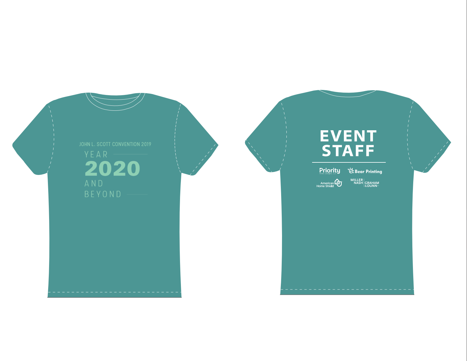
T-shirt mockup
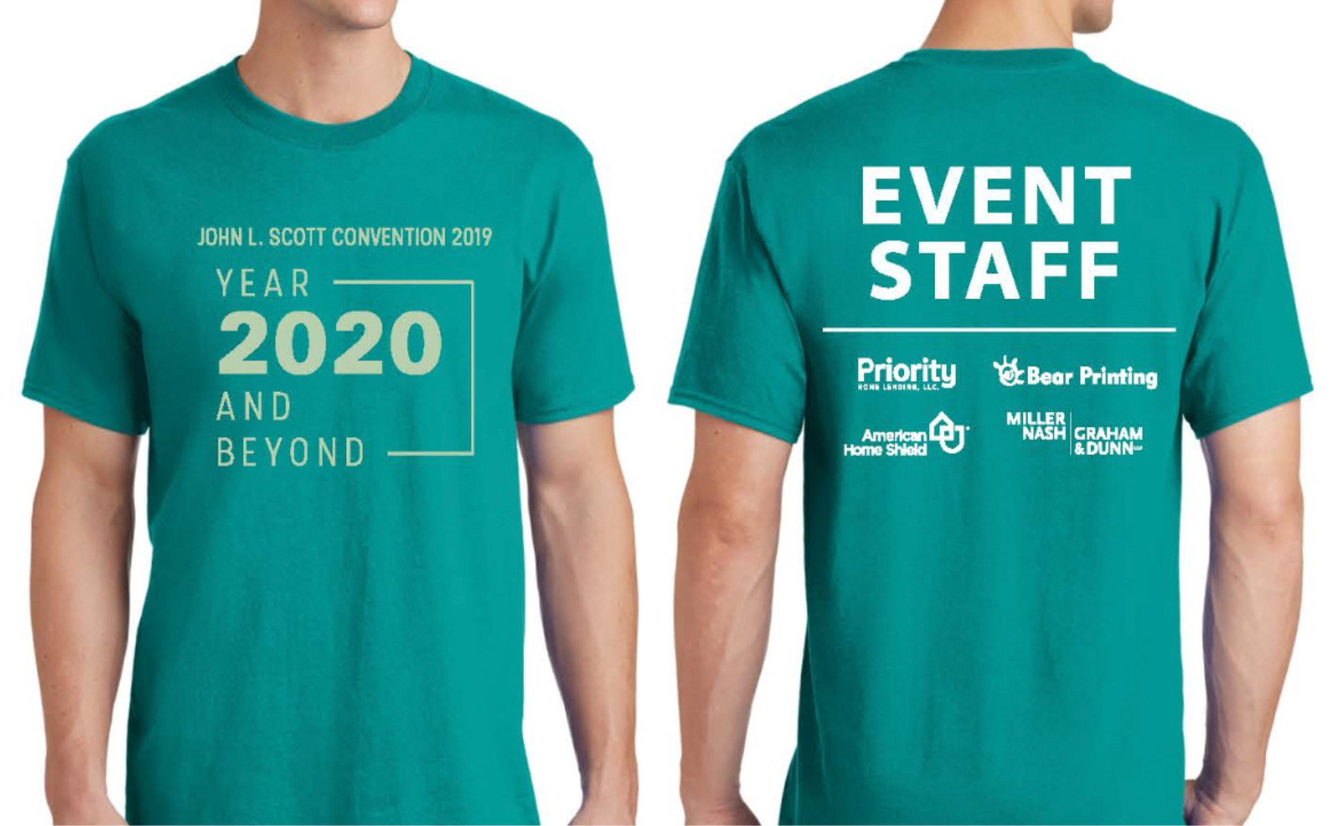
Final t-shirt design
T-shirt Design For The Event Staff
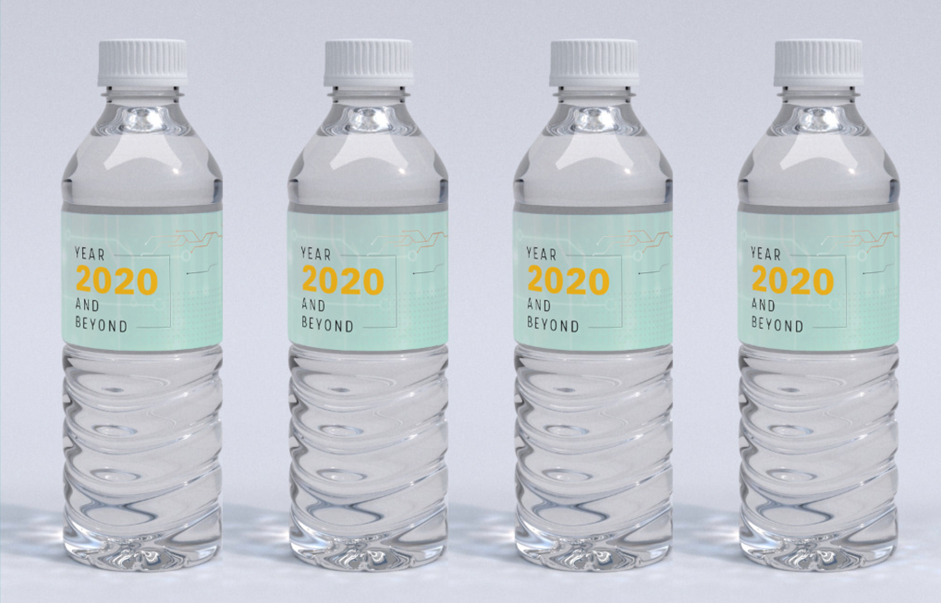
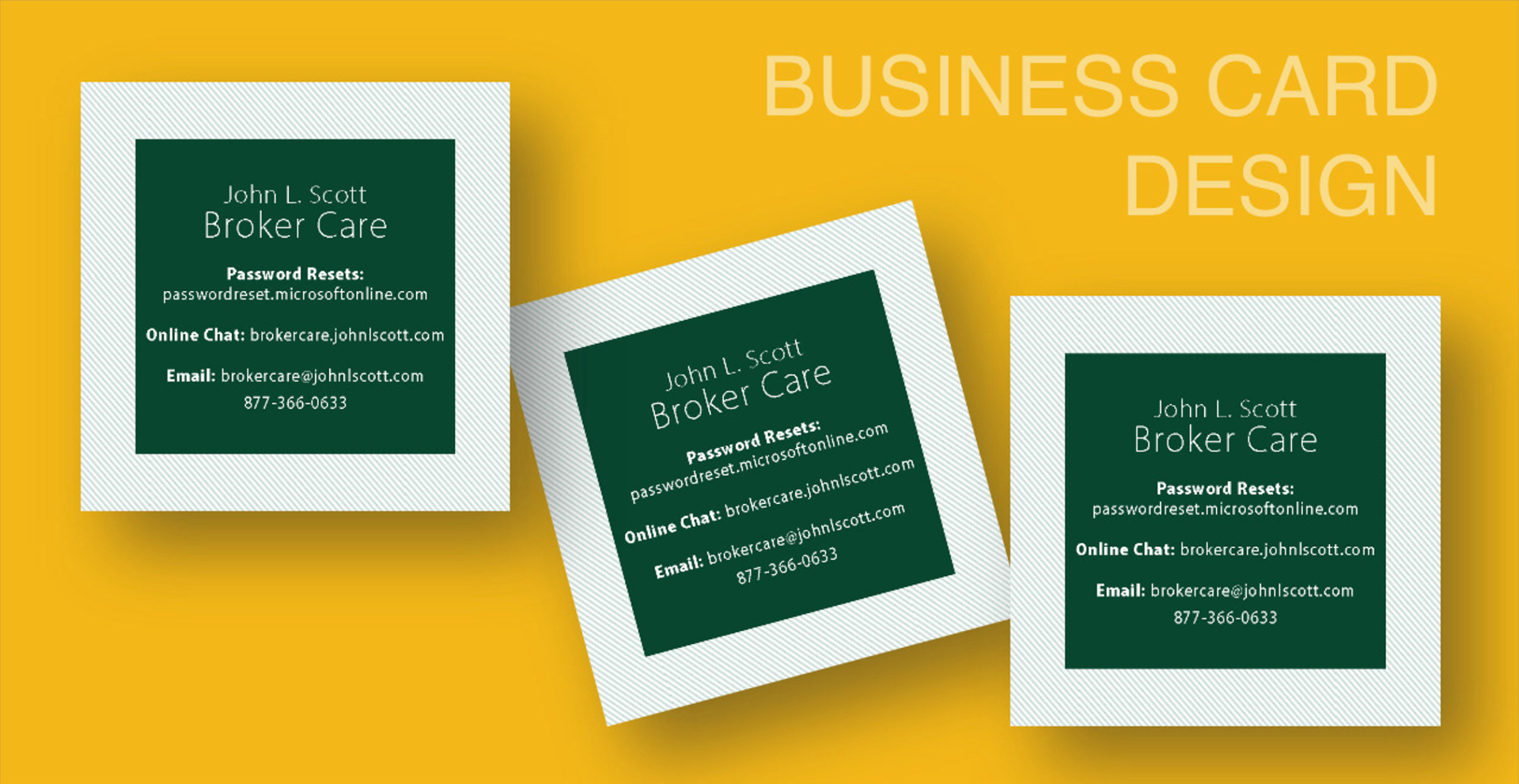
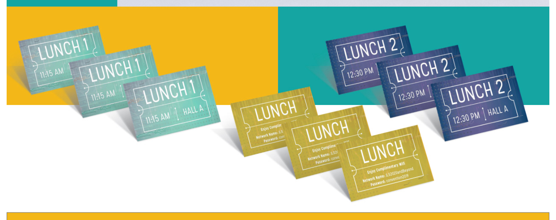
Bottle Label, Biz Cards, Lunch Tickets, and Tradeshow Hall Layout Design
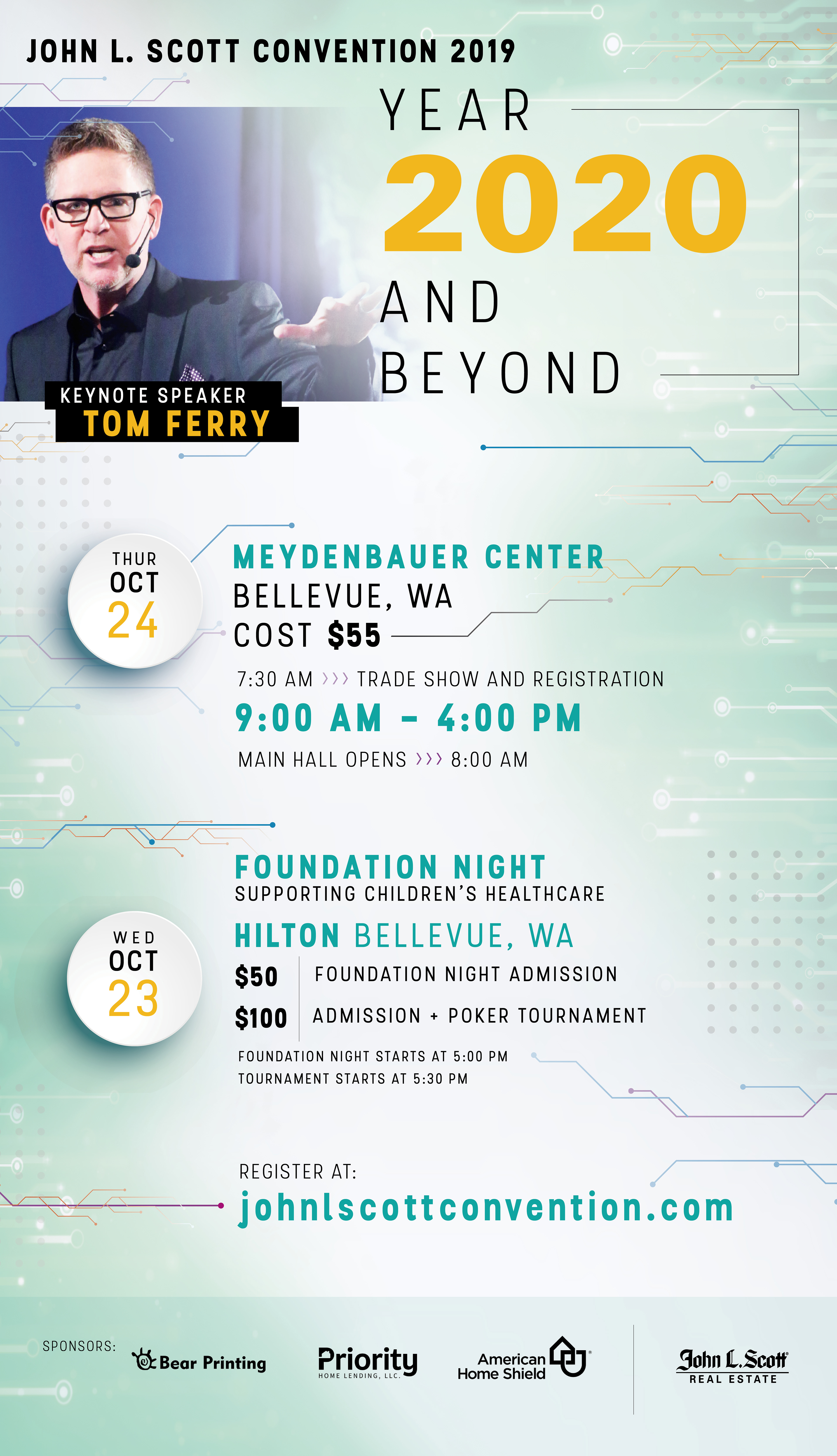
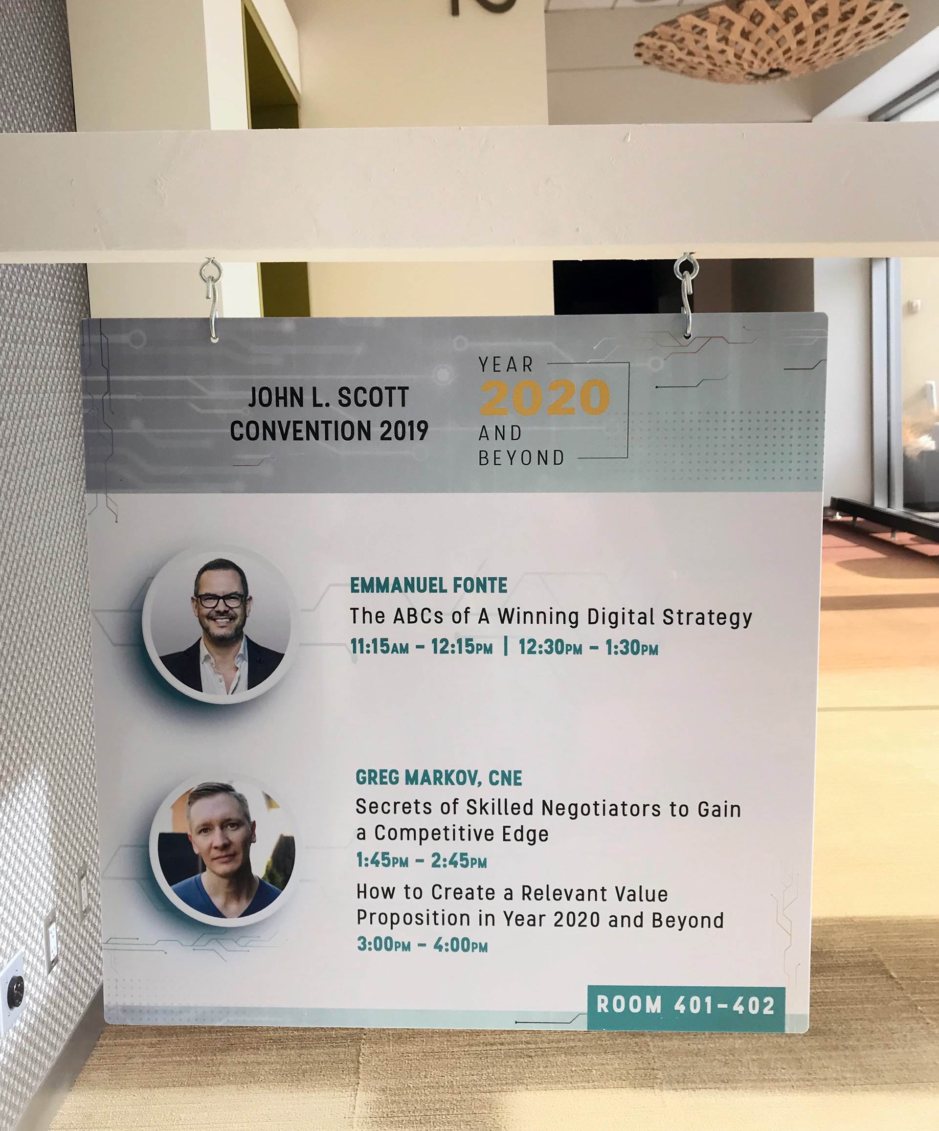
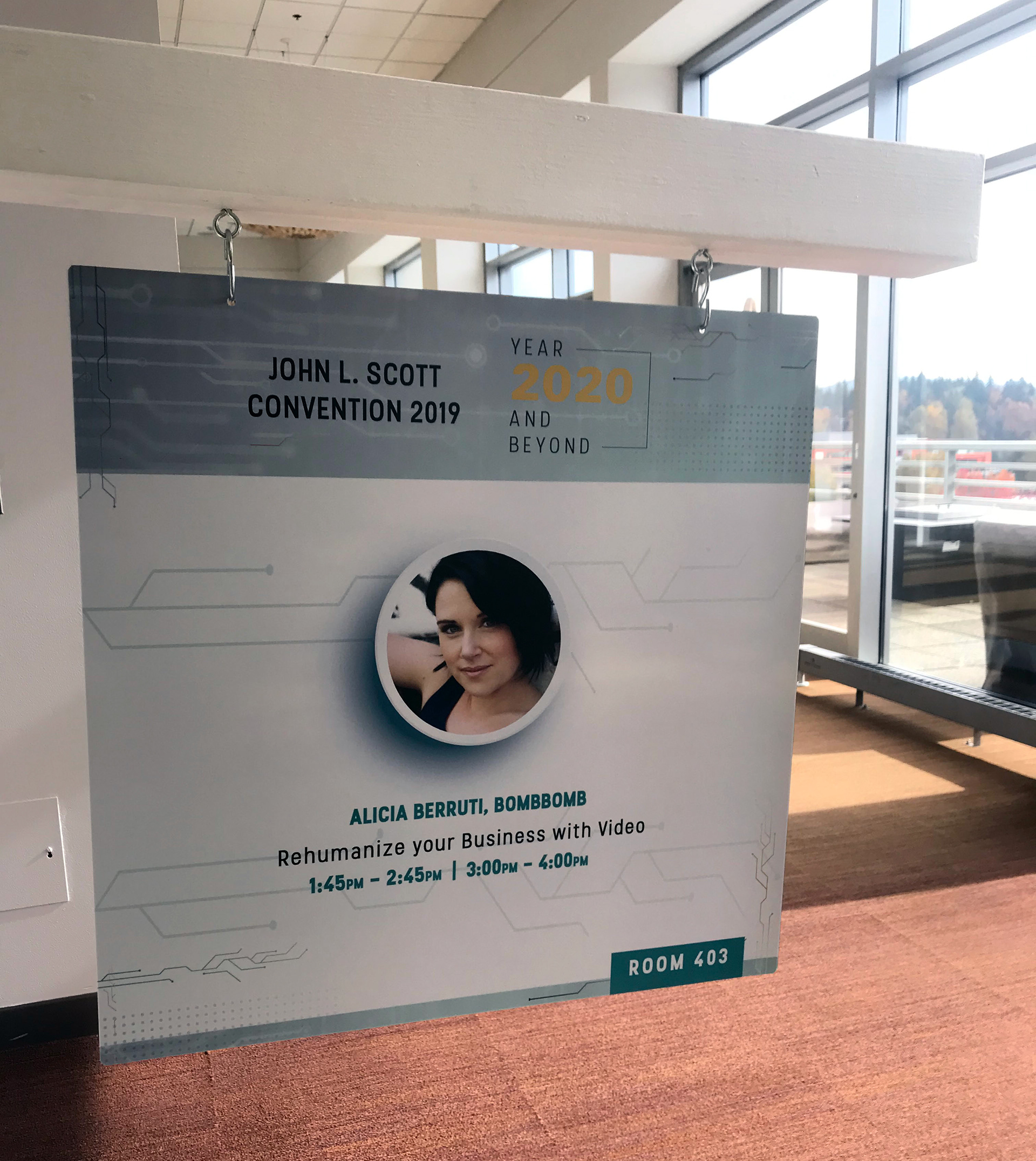
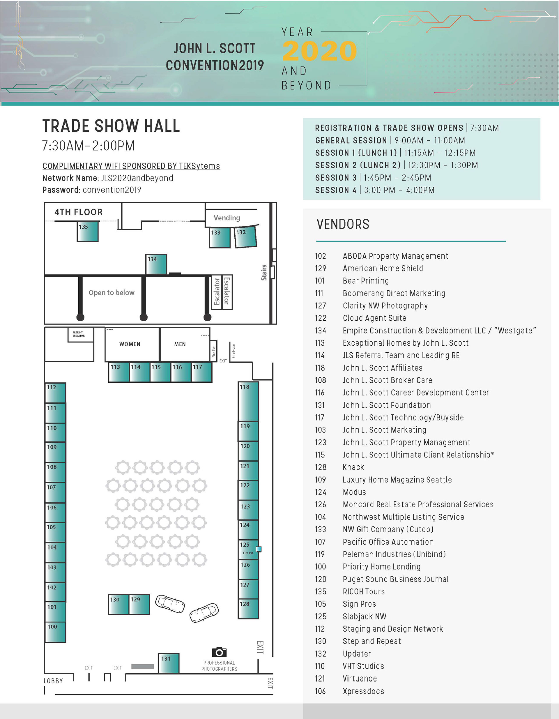
Poster, Yard Arms, and Trade Show Map Design
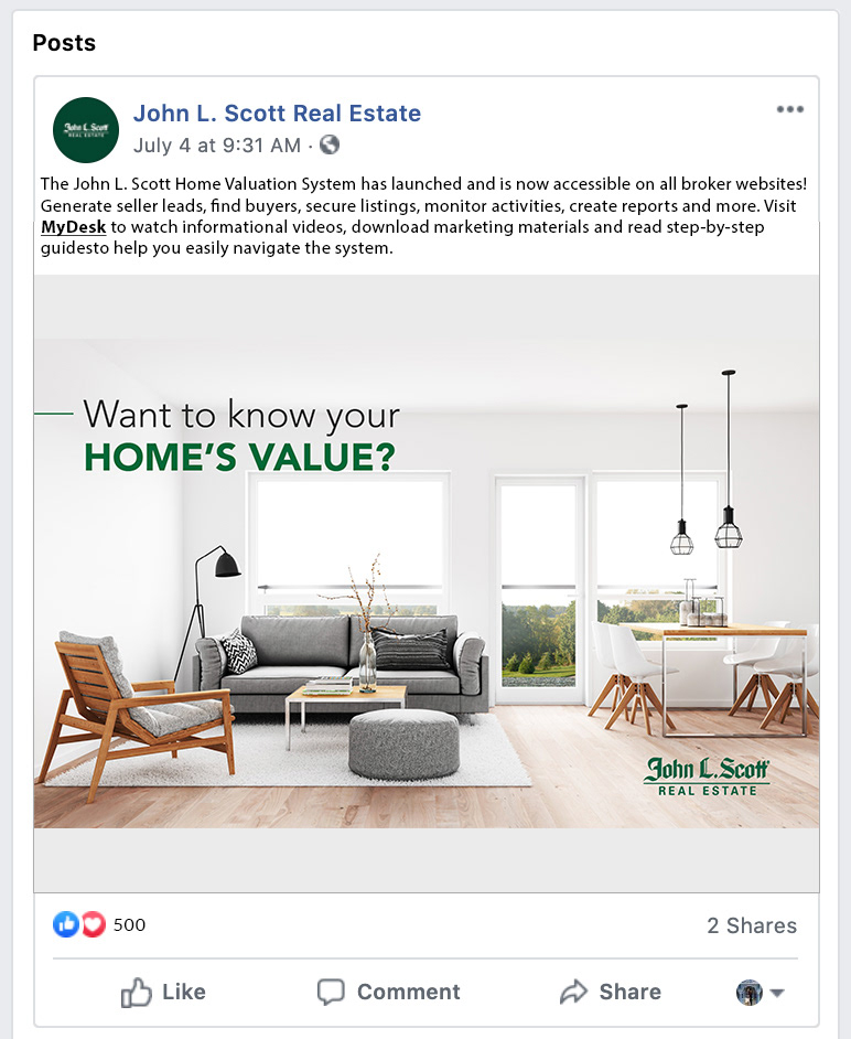

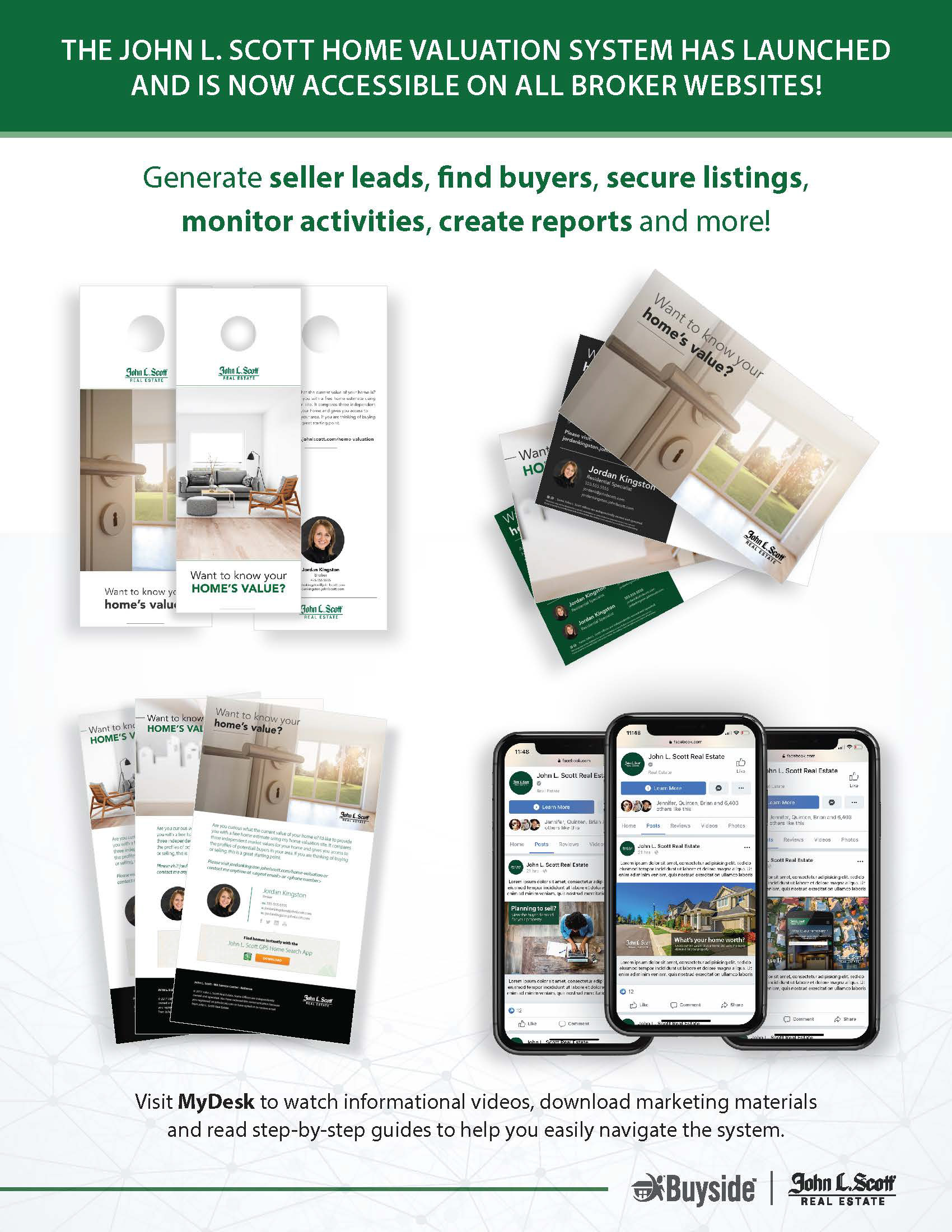
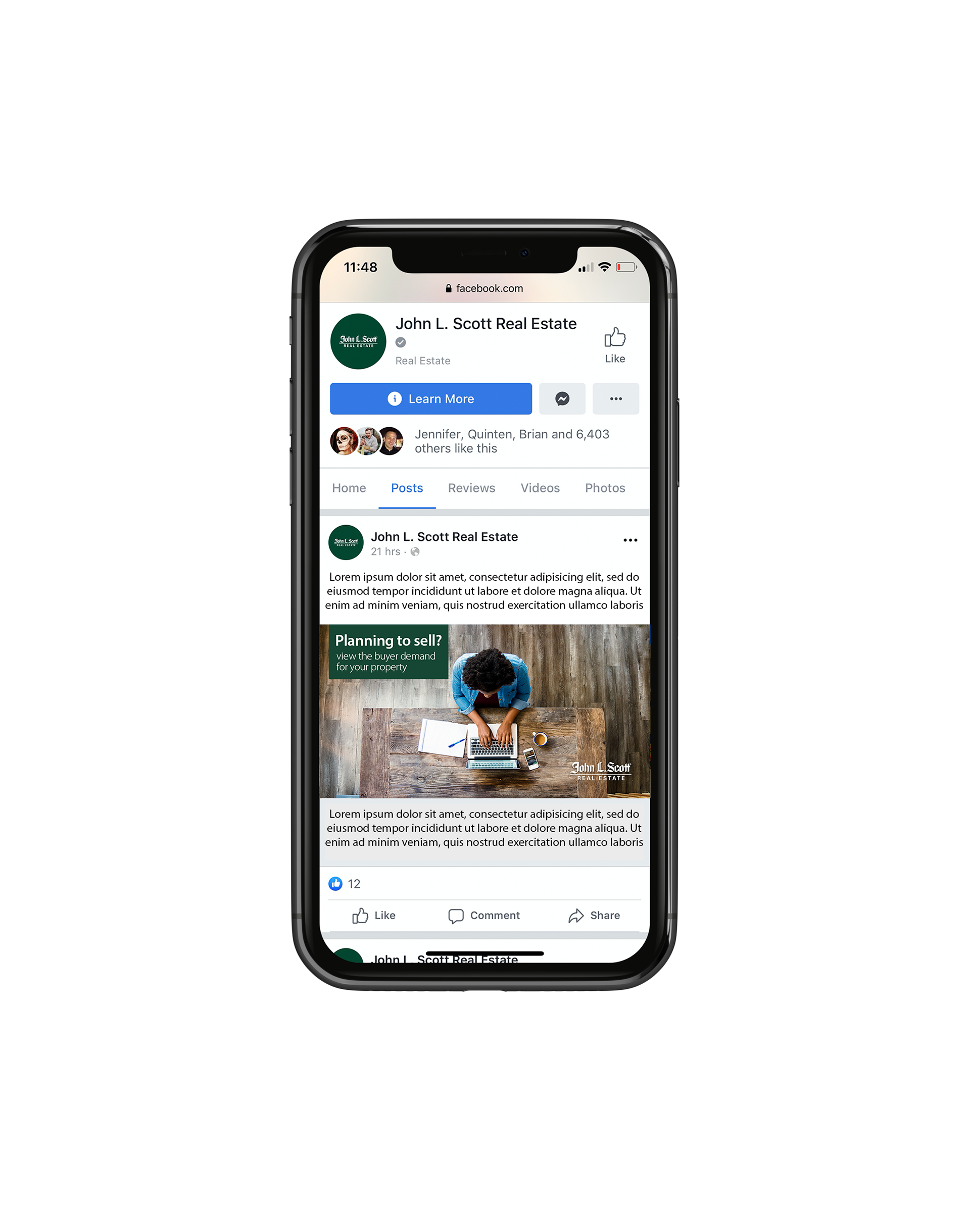
Digital flyers for the Buyside platform
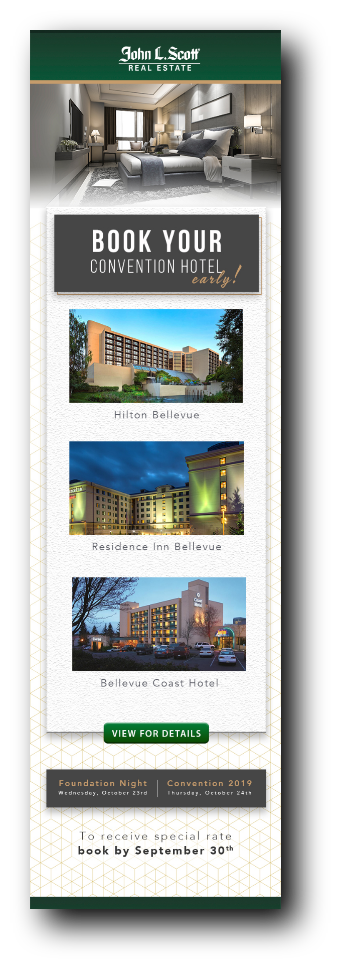
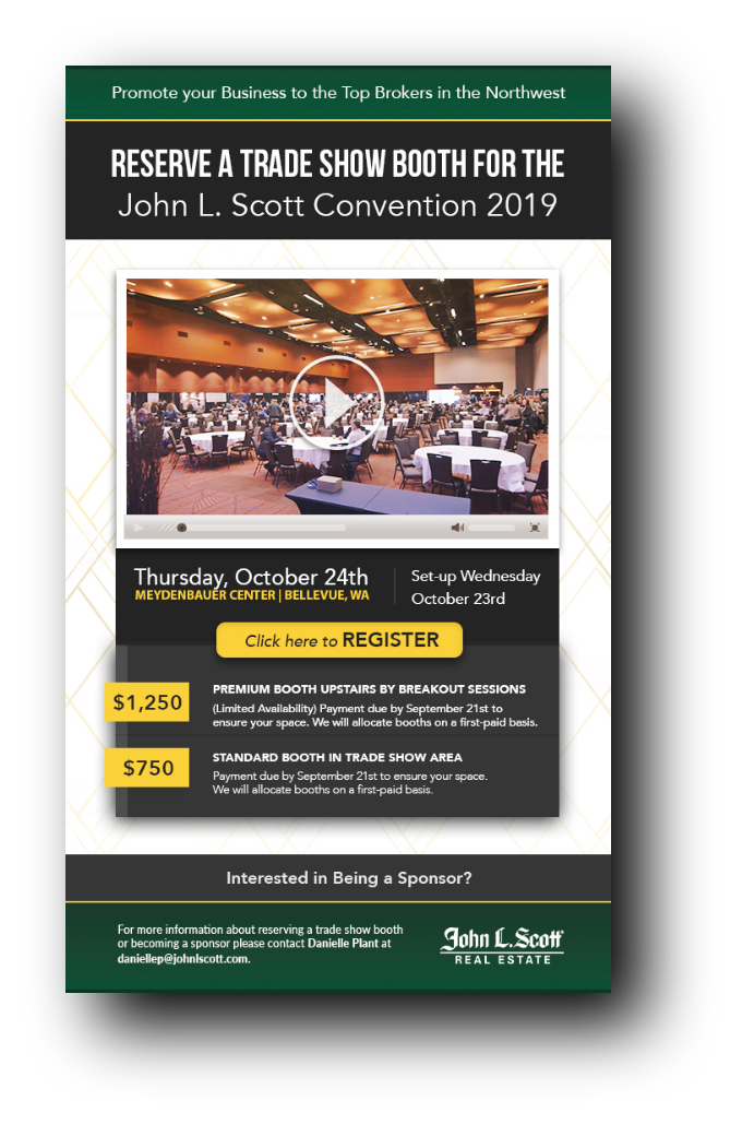
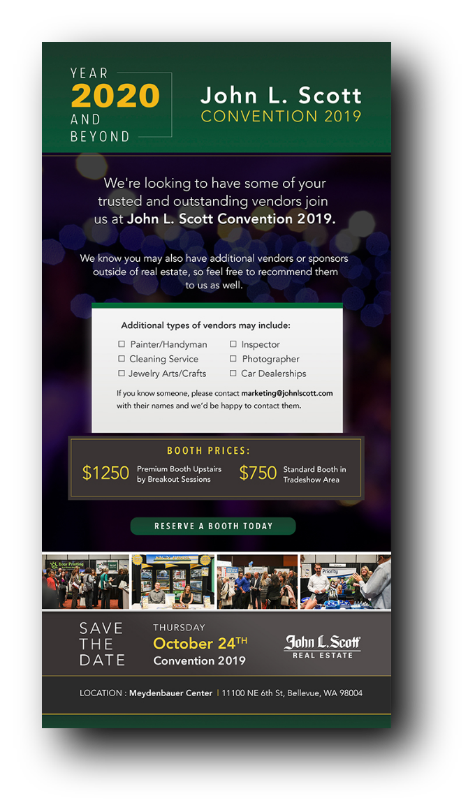

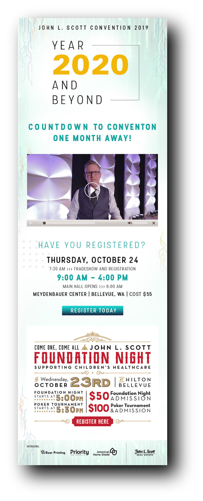
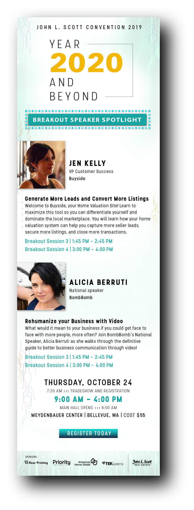

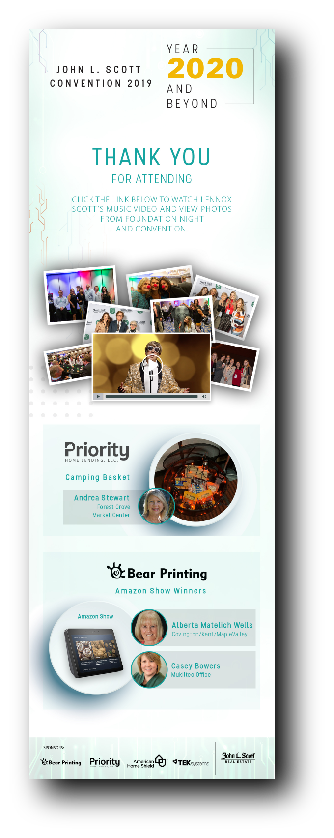
Email designs for the event
Learnings & Reflections
• Designing for both large-scale print and small digital formats simultaneously required constant attention to scale and readability
• Early vendor coordination was key to ensuring smooth print production
• Building a flexible design system early on saved time when last-minute content changes arose
Snapchat filters for the attendees to post on their social media profiles
Impact
The John L. Scott Convention 2019 brought together over 1,500 real estate professionals for a future-focused experience under the theme “Year 2020 and Beyond.” Designed to inspire innovation, collaboration, and growth, the event delivered both emotional resonance and measurable results.
Key Outcomes
• 1,500+ Attendees from across the Pacific Northwest
• 98% positive feedback from post-event surveys regarding event design and branding
• 500+ branded materials delivered, including stage visuals, digital presentations, signage, and swag
• 300% increase in social media engagement on event-related posts during convention week
• A unified visual system that improved brand consistency across all touchpoints
Tools used
• Adobe Illustrator
• Adobe InDesign
• Adobe Photoshop
• Adobe After Effects