UI/UX Design ⎯⎯ 2019
Branding &
App Re-Design

Overview
John L. Scott is one of the Pacific Northwest’s most recognized real estate brands. In 2019, their mobile app was due for a redesign to better meet the evolving expectations of tech-savvy homebuyers, sellers, and agents. The previous version was glitchy, lacked essential features for browsing listings and booking appointments, and had poor navigation that made the experience frustrating and confusing for users.


My Role
I led the redesign of the John L. Scott Real Estate app, focusing on improving usability, streamlining navigation, and enhancing key features, including property browsing and appointment scheduling. I conducted user research, created wireframes and prototypes, and collaborated closely with developers to ensure a seamless, intuitive experience that aligned with both user needs and business goals.
The Challenge
• Outdated user interface and visual design
• Inconsistent user experience across iOS and Android
• Clunky navigation and search filters
• Limited personalization and agent tools
• User drop-off at key stages in home search and lead generation
Goal
• Enhance usability and streamline property search
• Create a modern, cohesive visual language
• Introduce personalized experiences for buyers and sellers
• Improve engagement and retention for both clients and agents
• Align design with the John L. Scott brand while modernizing the overall experience
Discovery & Research
Stakeholder Interviews:
I partnered with product managers and marketing leads to understand key pain points from both business and customer perspectives.
User Research:
Conducted usability testing and surveys with a mix of first-time homebuyers, repeat users, and John L. Scott real estate agents.
Key findings:
• Users were frustrated with unintuitive search filters.
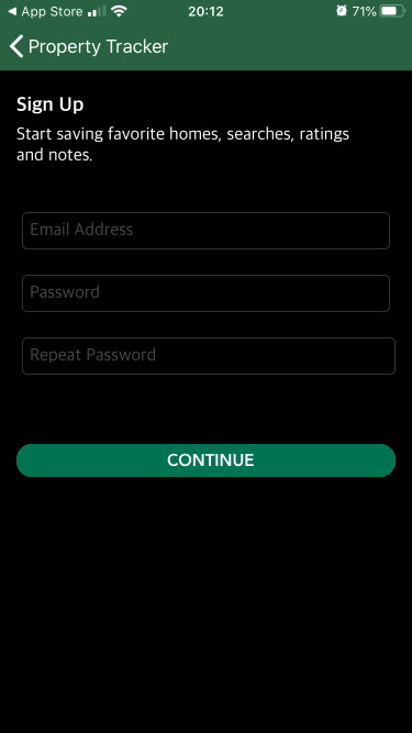
• Many didn’t complete inquiries due to form fatigue.
• Agents needed better integration with their listings and leads.
Competitive Analysis:
Benchmarked against Zillow, Redfin, and Realtor.com to identify opportunities for differentiation, especially in agent tools and regional personalization.
Design Strategy
Information Architecture Overhaul:
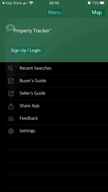
Redefined the structure of the app to reduce cognitive load and improve discoverability. Created a more intuitive tab-based navigation.
Modular Design System:
Built a scalable design system with reusable components, typography, and iconography tailored for real estate. Ensured consistency across platforms.
New Features Introduced:
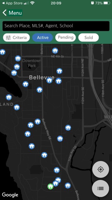
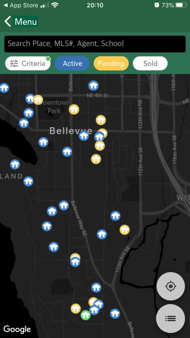
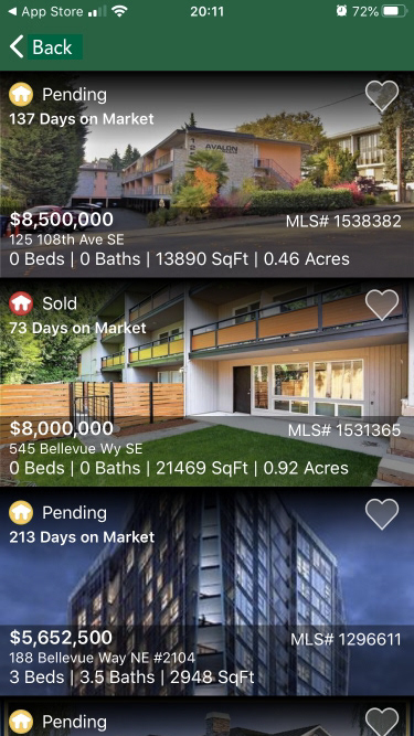
• Smart Search with geolocation and predictive filters
• Saved searches and personalized property suggestions
• Agent Connect: direct chat and scheduling with JLS agents
• Clean map and list view toggle with filters directly accessible

Visual Design
• Modernized the visual aesthetic while preserving brand equity
• Used the John L. Scott green as an accent across CTAs and highlights
• Clean UI with larger property photos and simpler layouts for browsing
Design System
⎯⎯ Typography
I chose Avenir typeface for its readability and versatility, making it a good fit for digital interfaces.
Avenir Bold
ABCDEFGHIJKLMNOPQRSTUVWXYZ
abcdefghijklmnopqrstuvwxyz
Avenir Semibold
ABCDEFGHIJKLMNOPQRSTUVWXYZ
abcdefghijklmnopqrstuvwxyz
Avenir Light
ABCDEFGHIJKLMNOPQRSTUVWXYZ
abcdefghijklmnopqrstuvwxyz
Avenir Light
ABCDEFGHIJKLMNOPQRSTUVWXYZ
abcdefghijklmnopqrstuvwxyz
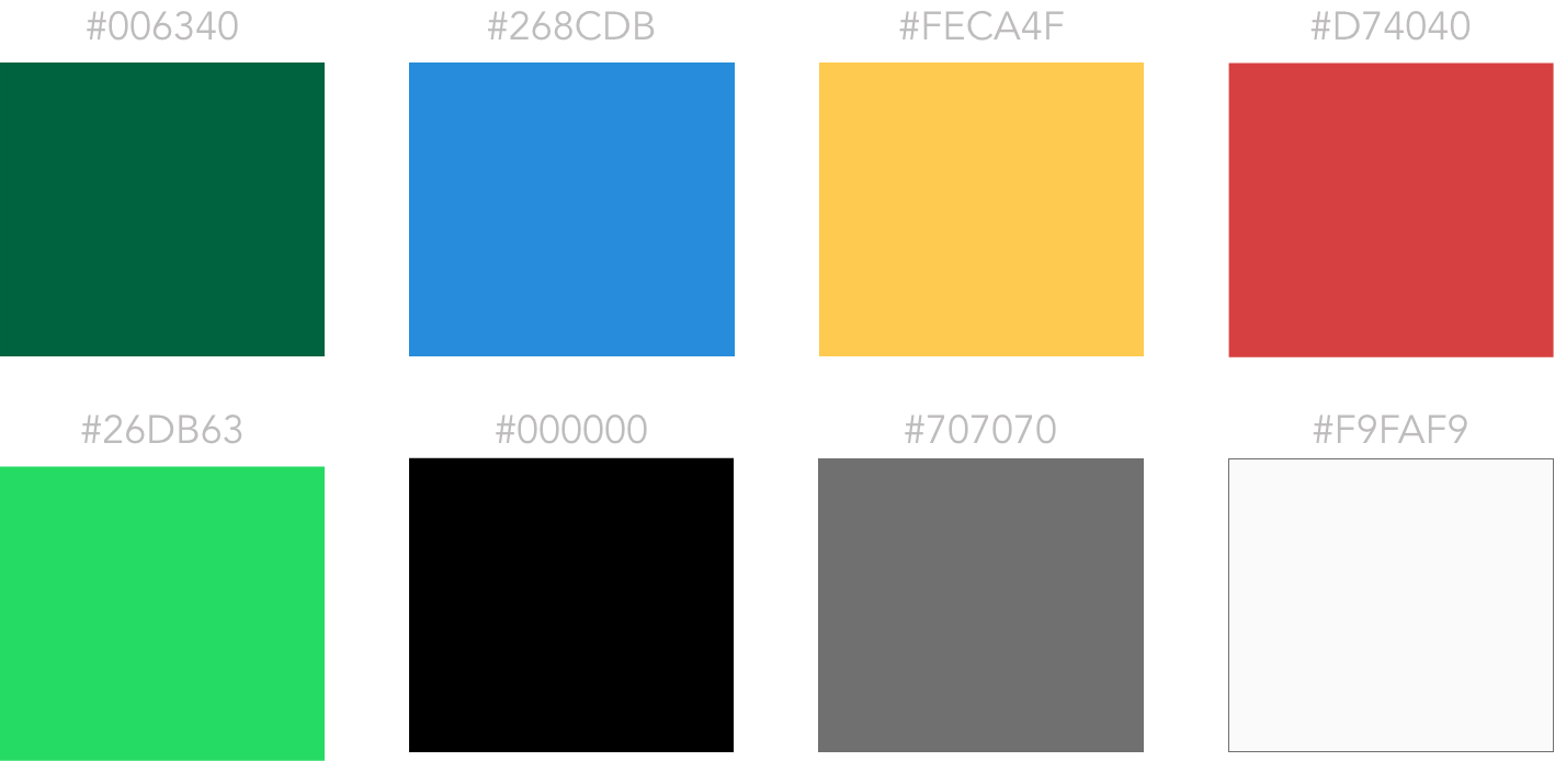
⎯⎯ Colors
Wireframes & Prototypes
• Created low to high-fidelity wireframes in Adobe XD
• Interactive prototypes tested with 12 users
• Iterated based on real-time feedback and behavior patterns
Lo-Fi Wireframes

Hi-Fi Wireframes


Impact
• 30% increase in completed property inquiries
• 25% improvement in app store ratings within 3 months of relaunch
• Higher retention due to personalized features and improved speed
• Streamlined onboarding led to a smoother experience for new users
• Agents reported improved efficiency and client connection through integrated tools
Reflections & Takeaways
What I Learned
Designing for Dual Audiences Requires Balance: One of the most significant lessons was designing for two distinct user groups, buyers and agents, each with their own unique needs and behaviors. Creating flows that served both without overcomplicating the experience was a valuable exercise in prioritization and hierarchy.
The Power of Iterative Testing: Rapid prototyping and early user testing helped us validate assumptions before investing in high-fidelity designs. This reinforced the importance of designing with, not just for, users.
Collaboration Fuels Better Solutions: Working closely with product, engineering, and marketing teams showed me how cross-functional input leads to more well-rounded design decisions and how crucial early alignment is for efficiency.
Design Systems Improve Velocity: Building a modular design system not only helped maintain visual consistency but also sped up development handoffs and future scalability.
What Could Be Done Better
More Inclusive Research: While we gathered feedback from users and agents, a wider demographic sampling, especially among underrepresented homebuyers, would have made the solution more inclusive and representative of diverse needs.
Deeper Agent Tool Integration: Some agent-facing features felt like a “Phase 1.” In hindsight, dedicating more UX attention to the agent experience (such as dashboards, lead management, and communication tools) would have made the platform even more powerful for power users.
Post-Launch Tracking Plan: A more robust post-launch analytics setup would have allowed us to continuously monitor specific user flows, like saved searches or agent contact rates, and iterate based on real data, not just anecdotal feedback.